Creating & Modifying Layouts
If you take one thing from this page: a template is a reusable page layout. You pick one, fill it with your own text, images, colors, and links, and it handles the design — spacing, responsiveness, brand consistency — for you. (Under the hood, developers build templates as code. You never see that side.)
This page covers the layout tools on both surfaces: templates, slots, and nested layouts on the web, and categories and screens in the mobile app.
Templates: layouts you fill in
When you create content from the Component modal's Templates tab, you browse a library of pre-built layouts — like 2 Column Stacked, Full Width, and 3 Column Stacked — organized by category, each with preview examples.
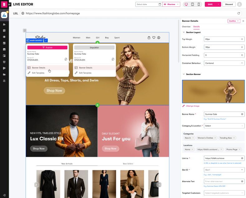
What you'll see in a template form
Once you pick a template, you get a form — no code, just fields. Depending on the template, fields will be:
- Text — headlines, body copy, button labels
- Color pickers — background and accent colors
- Images — pick from your Media Gallery
- Links — where clicks and taps go
- On/off toggles, numbers, and dropdowns — layout options the template designer exposed
Related fields are grouped into sections, each field has a short description, and a live preview updates as you type. Templates are responsive automatically — the same content adapts to desktop, tablet, and mobile with no extra work.
Templates are built by your developer or the BILDIT team. If none of the available templates fits the campaign you're planning, that's a request to make — not a workaround to hack.
Slots: the regions of your web pages
Your website's pages are divided into named regions called slots (like HOME-TOP-SLOT). Your developer defines where slots sit on the page; you control what fills them. Each slot shows how many pieces of content it currently holds, and a slot can hold several — order and timing decide what shows when (see Publishing & Scheduling).
In a busy editor view, collapse slots you're not working on to focus:
That's a page-structure change — one for your developer. What you can change yourself: everything inside the slots.
Nested layouts: content inside content (web)
Some templates have slots of their own — for example, a hero layout with three promo tiles inside it. That's nested scheduled content: a parent layout whose inner slots you fill with other pieces of content.
To fill one: open the parent content, and in each inner-slot field click Select from Banner List (this opens your scheduled content picker), then pick the content for that spot and save.
The rules to know:
- One level deep only — nested content can't contain further nested content.
- You can't select the item you're currently editing, content that already has children of its own, or deleted content.
Mobile app layouts
Show, hide, and reorder categories
Your app's product categories can be hidden (a seasonal section in the off-season) or reordered (put the promotion up top) — no app update required:
App screens ("Specifications")
Each screen of your app is configured by a Specification — the VXE's name for a screen's setup. Inside a specification you can update configured images (click the Camera icon to pick from your Image Library) and text or links, which lets you refresh a screen's imagery and destinations yourself:
Creating new specifications or adding components (the app's building blocks) is developer territory — components are versioned code modules your developer publishes, which then appear in your pick-lists.
Related technical docs
- Templates overview · Standard Template Guide (the developer-side authoring reference)
- Nested Scheduled Content — full nesting behavior
- VXE interface tour (Web) — slots and the editor ribbon
- Categories · Specifications · Components